One may see the cathedral as a breath taking depiction and
well suited as a church; the long vertical lines show a sense of reaching for a divine or someone above. The circular window creates unity. However, because this is art, the perception is belongs to individuals.
Time changes and styles change, designers
experience a cycle in which they peak and decline at different moments and what’s accepted in one decade fades and becomes a new trend. It’s important for a piece of architecture to translate throughout the centuries; is it able to stay in style and if not is it able to be conformed into the style of the moment? Going with a diagonal exterior I feel is dangerous because of the uncertainty of the popularity of a design with diagonals. For everyday buildings, why not make the inside more of what matters.
The Tate Modern contemporary art museum is a modern design of the decade. The question is will the building still be popular as styles and trends in architecture change? Architecture is art, but I feel some people are taking it too far; I am more into the utility than the defiance of what’s common in architecture.
Illuminate. Light is a crucial factor in a design process. Without light, the art of the building is not seen by the audience. The environment around us that consumes us and protects us cannot be enjoyed if it’s not seen. And with the abilities of designers today, light can show off great craftsmanship and is a way of communicating their ability to the public as well as their service to the public. The creation of light in room is half of the beauty of the design.
Commodity, firmness, delight. The foundation of the design process. A piece of architecture, because architecture is unavoidable, must satisfy the needs of the society or consumer. Why have structures if you cannot use it? Why have unstable structures that cannot seem to withstand the test of time? (I feel the lack of a solid structure shows a lack in the designers ability, their product will become an example of them and their ability.) Why have a building that doesn’t bring delight?
How are things delightful?
Rhythm and proportion; do the parts make sense, do they form a mathematical and geometric relationship (Roth, 71)?
Ex. rhythm: alternation between solid and void (Roth, 76)
Texture (Visual pattern at large scale (Roth, 80)); providing a variety for the eye to engage in
Light; gives off moods and is how one experiences the space (Roth, 85)
Ugliness (confusing/ ambiguous pattern, monstrous, doesn’t conform); look beyond the surface, thinking deeper that beauty (Roth, 89)
Ornament and sound

Story. A building can stand as a building, just as a painting can stand as a painting. The true beauty that comes in a building or painting is when there’s a story behind the piece. It can obtain its own story through its lifetime, like the
Architecture is unavoidable; it consumes us and protects us and is necessary. Architecture is the art form we inhabit (Roth, 6). Without designers, without principles as to approaching design, society would be at a loss. Commodity, firmness, delight provide the foundation which illumination, story, translation are factors of the three principles. And sprung from the results can be variety of perspectives.
Arch: alternative for spanning the opening (Roth, 32)
(Roth, 34)
Aedicule: basic building unit of space that helps us to understand a bigger picture/plan
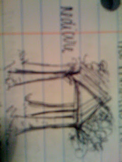
Attempt at drawing the gist of “The Primitive Hut” by Laugier: 4 tree’s branches cross in a triangular form to form a house-like structure.
The diagonal emphasizes movement.
Interwoven spaces- fluid, loosely defined (Japanese screens)
Static spaces- discrete rooms with obvious intentions (traditional European and American design)
Directional space: directs movement toward a single focus (cathedral)
Non directional space: no one obvious path through the building; variety to choose from
“Beauty will result from the form and correspondence of the whole, with respect to the several parts, of the parts with regard to each other, and of these again to the whole; that the structure may appear an entire and complete body, wherein each member agrees with the other, and all necessary to compose what you intend to form.” –Palladio
Being unsure of my major and taking this class out of my interest in art, I am trying to see where my interests can take me as far as careers go. This quote, I can see how it relates to architecture very much so because architecture is an art form and is to be respected as such; just as easy as it is to ask what’s missing in this drawing, a piece of architecture could be asked the same question; what more can I stress? What more needs to be emphasized? Is it balanced? Is it appealing? I find much value in this quote also for my experience in drawing; the piece is to be in harmony and is to come together as a whole. A piece of art is to be balanced and appealing and to “appear an entire and complete body.” My artwork throughout the years has been a way for me to explore creativity and I can relate to the statement that it must be complete. Many times I found myself wondering what’s missing in a piece and until that is determined, my piece was at a loss.


No comments:
Post a Comment